Elumity’s Challenge: Creating A Global Tool For Community Research
Created by a team of renowned neurosurgeons based in Switzerland, “Ability” was a computer/mobile application targeted at medical and research professionals, with the goal of simplifying the collection and analysis of data, publications, medical journals, articles, and other resources. Ability allows a user to collect insights and conclusions from multiple sources in a single place called a “card”, while retaining all sources in their entirety. These cards can be shared amongst all users across the world, so entire communities can contribute to and benefit from the collection and organization of data. Prior to their launch, Ability engaged us to help them define what the brand should stand for (their positioning), to create a new name (“Ability” was not legally viable), and then bring the brand to life via a visual identity system.
Our Strategy: Illuminating A Path Forward
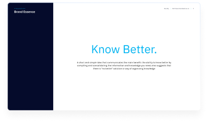
After a rigorous process of development and presentations, the positioning selected was “Know Better”, a subtle play on words that spoke to the ultimate benefit of the offering: the ability to easily share and consume knowledge, while also poking fun at alternative offerings.
We then created hundreds of name candidates that reflected the Brand Positioning Idea and Pillars. After much consideration, as well as legal, domain, and linguistic screens, “Elumity” was selected as the final name. The name highlights illuminating knowledge and guiding researchers. The “ity” ending, inspired by “capacity” and “community,” reflects the product’s ability to share research efficiently, while also nodding to their original name, Ability.
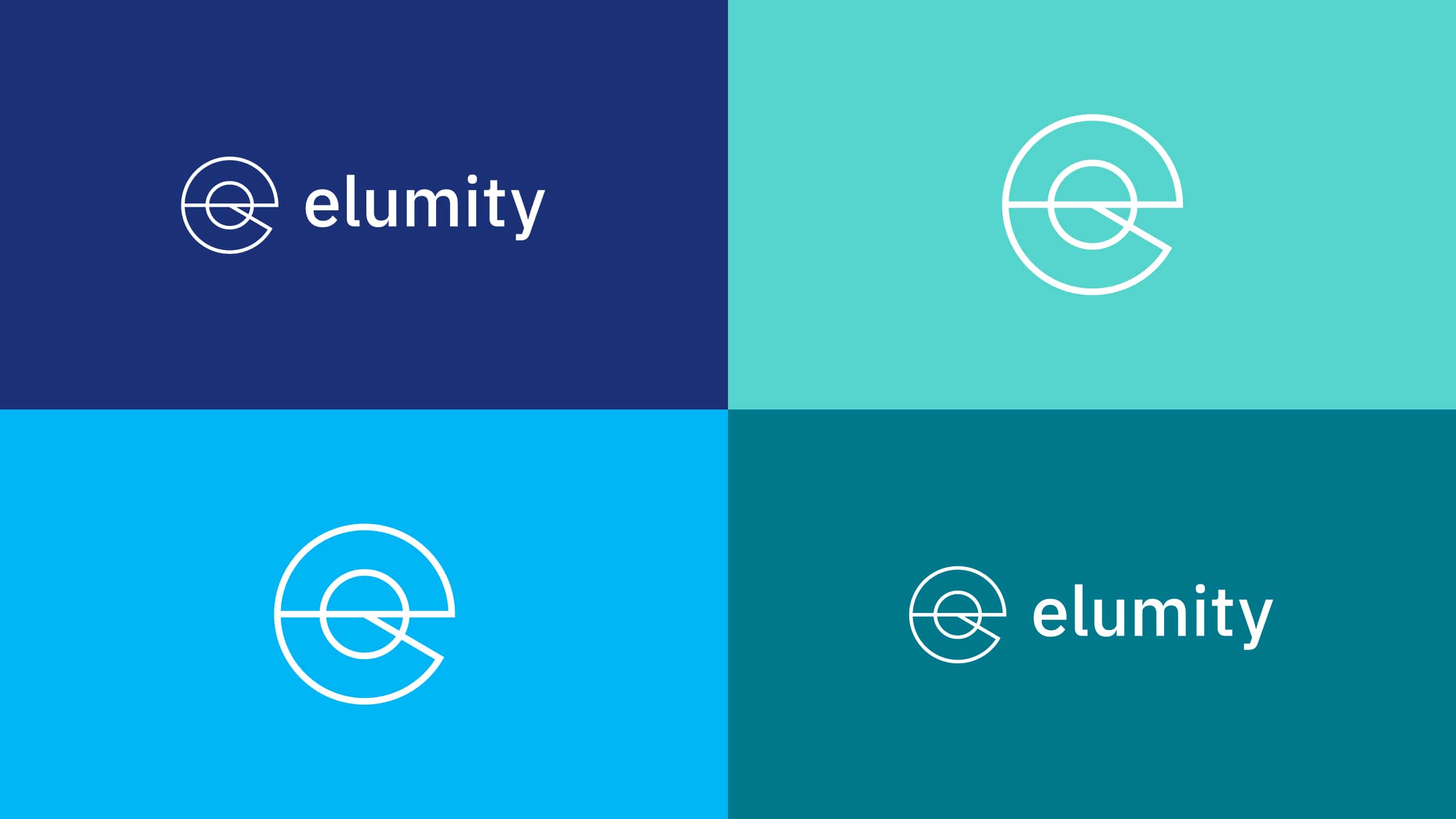
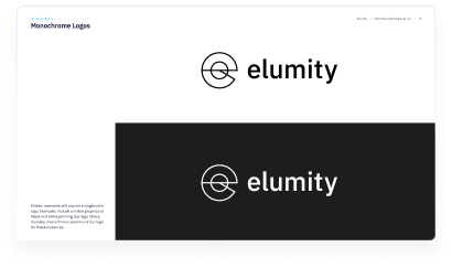
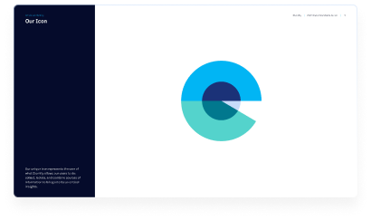
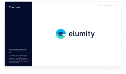
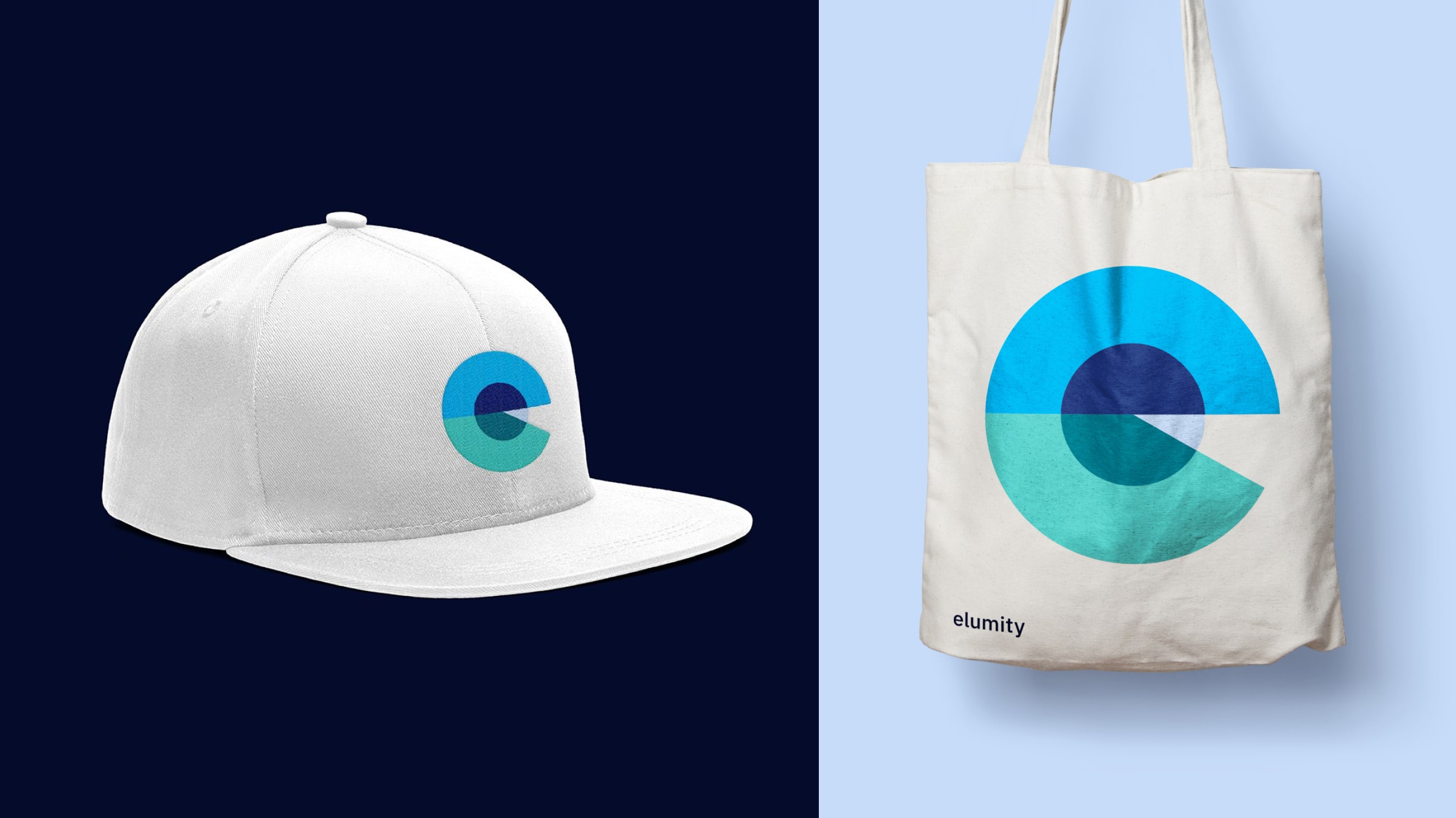
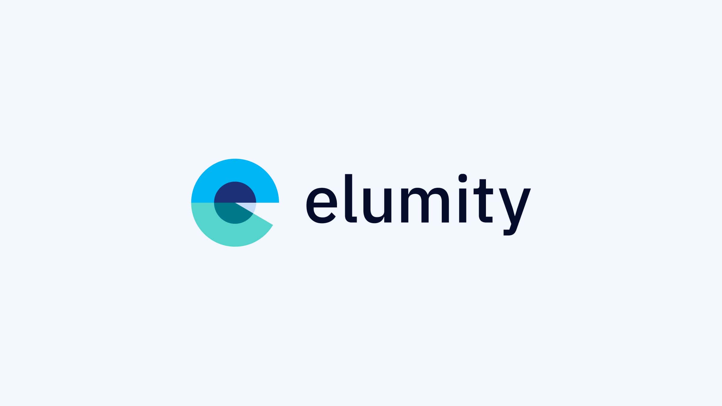
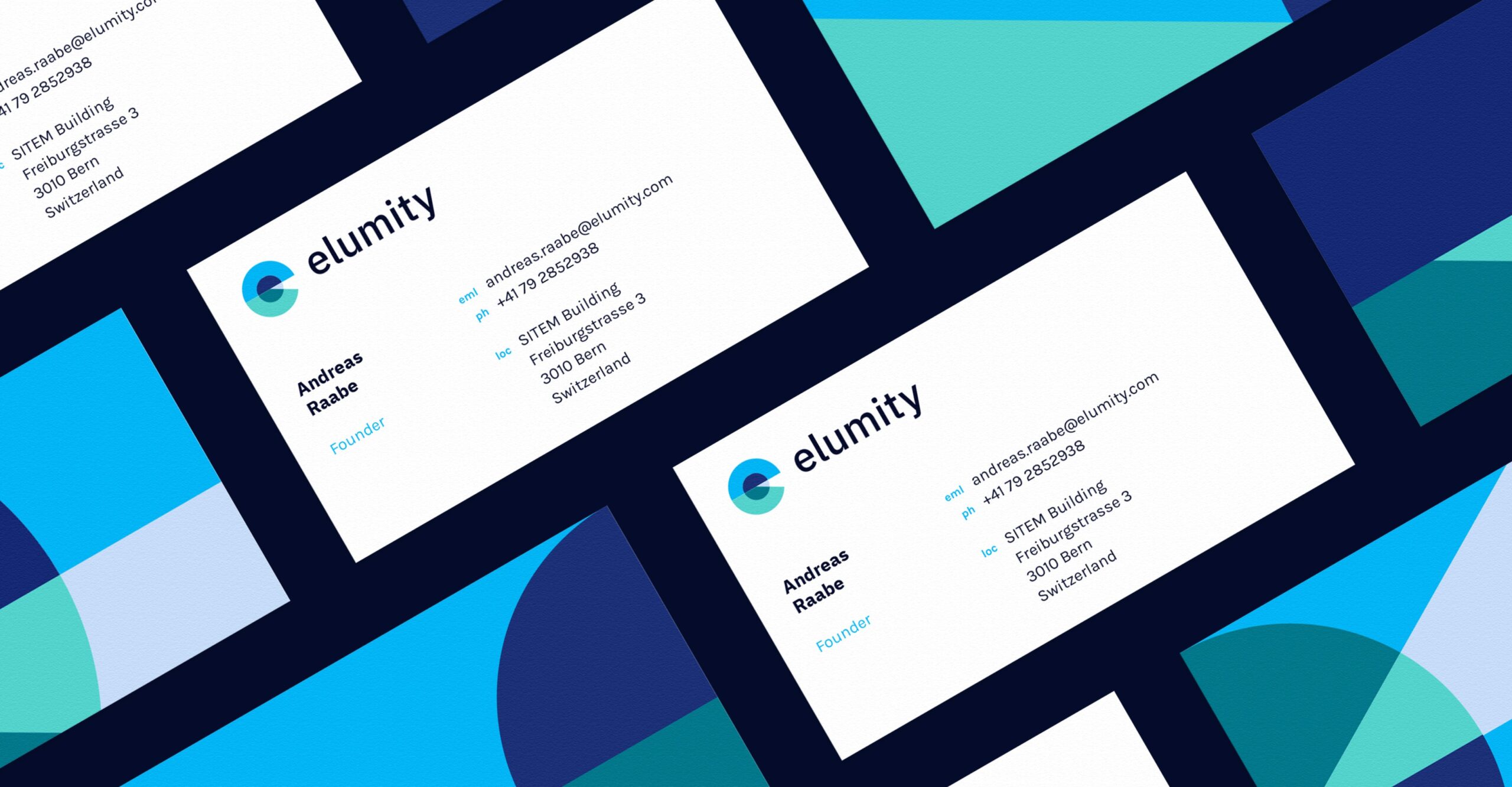
The logo features semi-circles symbolizing various information sources merging, with the central circle representing the data in a card. The overlapping colors convey confidence and clarity, forming a shape that echoes the “e” in the name. A solid black, all-lowercase font balances the heavier symbol, adding a unique, modern touch.
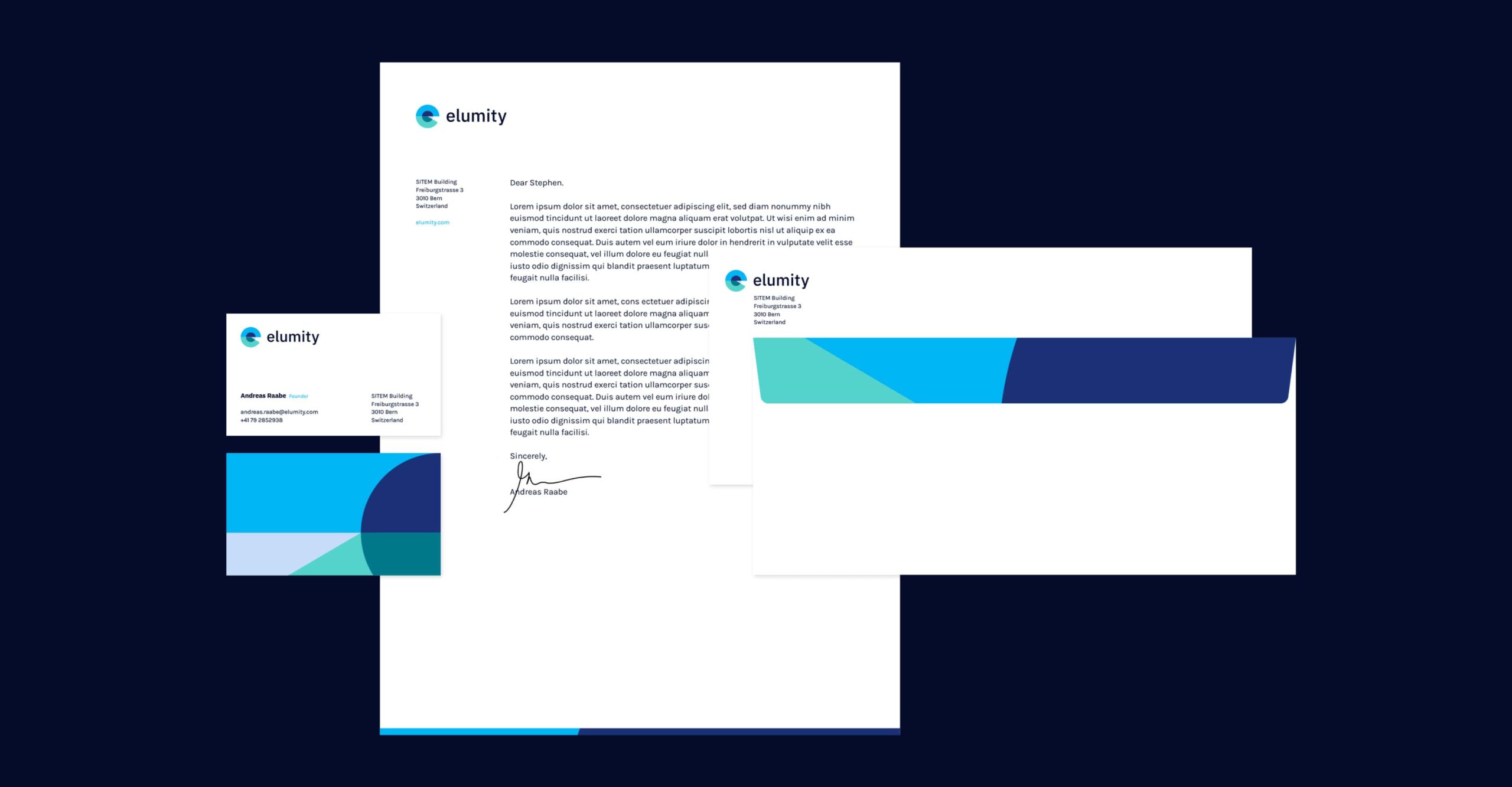
Achieving Enlightenment: Elumity’s identity is brought to life
With a clear brand positioning, a distinctive name, and a cohesive visual identity, Elumity successfully launched, making an immediate impact in the research community. The brand effectively reflected the platform’s innovative approach to simplifying knowledge-sharing across global audiences. As a result, Elumity has transformed how medical and research professionals collect, organize, and share critical data, creating a collaborative network of informed and empowered users.