



Taillight’s Strategy: Making Independence Visible
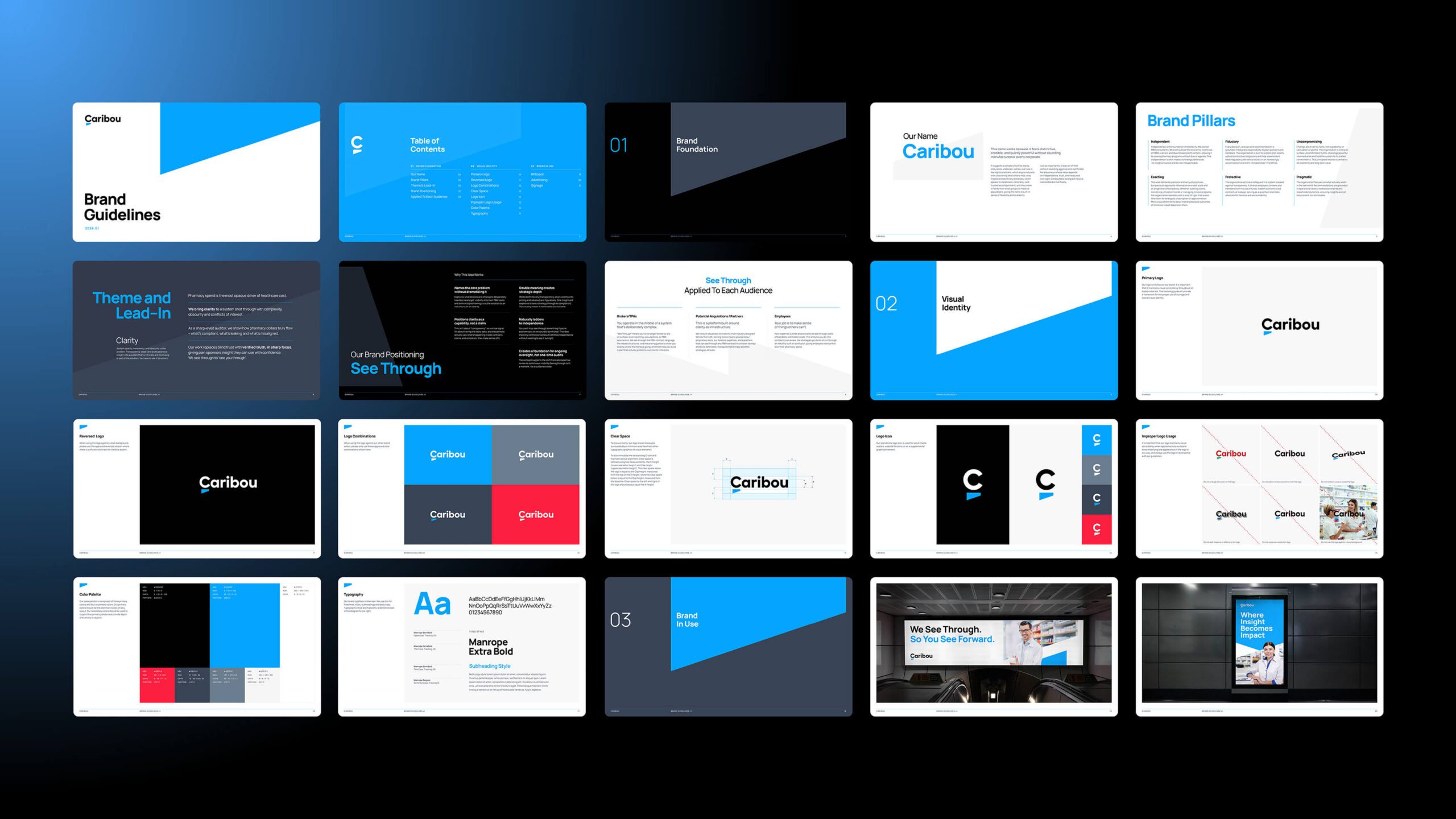
The Caribou rebrand started from a simple insight: in a system built on opacity, clarity is the product. We built the positioning around See Through, an idea with a deliberate double meaning. Literally, Caribou sees through PBM contract language, rebate structures and pricing to show where pharmacy dollars truly flow. Figuratively, it has the expertise to see a client’s strategy through to completion. And because only an unconflicted party can truly see through a system, the idea reinforces Caribou’s independence without having to state it. Six brand pillars, a brand story and audience-specific messaging for brokers, partners and employees complete the platform.
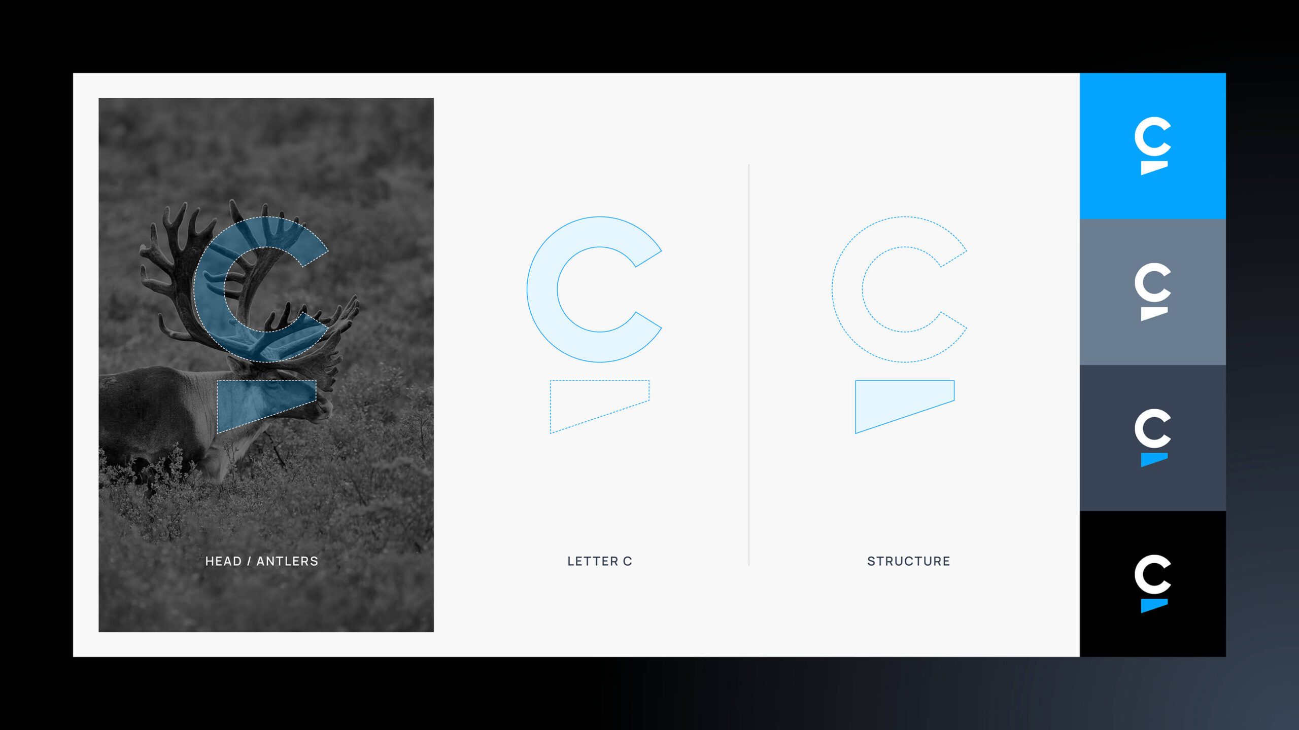
The visual identity carries the same precision. The new symbol combines a refined letter C with the form of a caribou’s head and antlers, a structured mark that conveys steadiness and control. A confident blue palette and clean typography extend it across advertising, signage and digital.
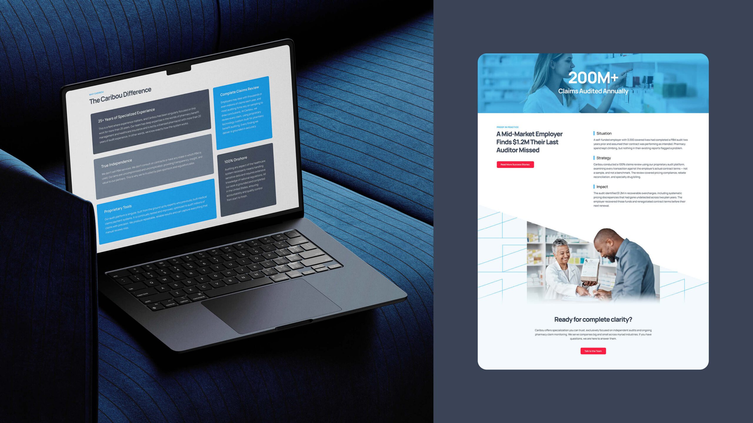
We then translated the brand into a 10-page informational website, from information architecture and content strategy through copywriting, design and development. Built for brokers and consultants as its primary audience, the site leads with independence and backs it with proof. It is also structured for both traditional and AI search, with Q&A content on the About and solution pages designed to make Caribou a source AI engines cite.
The Impact: A Brand Built to Be Trusted on Introduction
Caribou now enters every sales conversation with a brand that matches the rigor of its work. See Through gives the company a clear, ownable idea that shifts the conversation from saving money to protecting plan assets, while the new website gives brokers and consultants a credible place to land before making an introduction. With a site designed to grow alongside an ongoing insights program, Caribou has the foundation to build authority on PBM oversight and fiduciary responsibility as scrutiny of the category intensifies.