Taillight’s Strategy: Designing the Balance Between Human and Machine
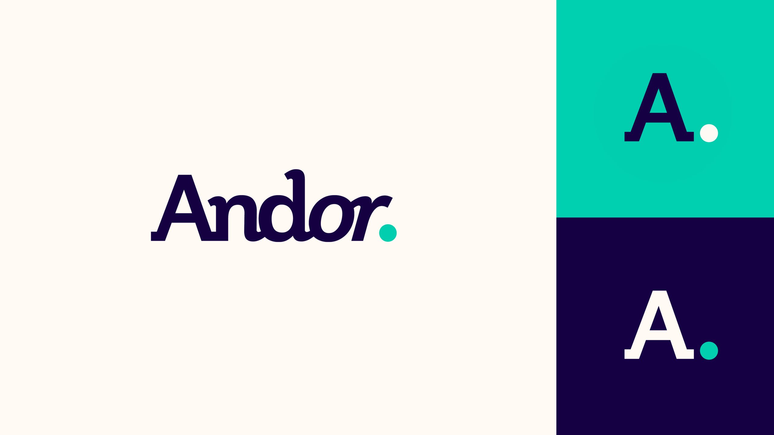
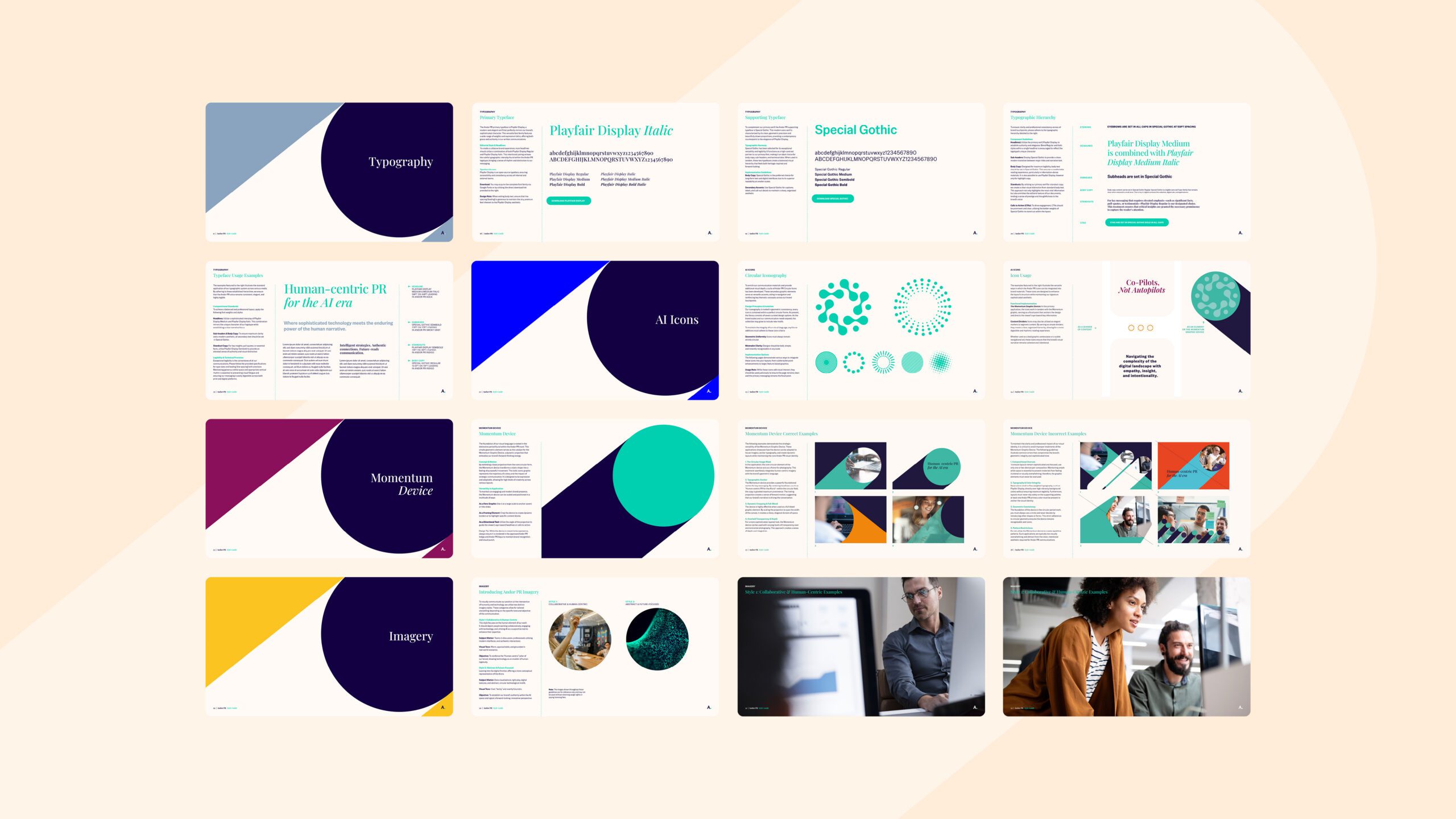
We built the Andor PR brand identity around a custom logotype refined from a classic slab serif. Setting “And” in roman and “or” in italics draws out the dual nature of the name, while a terminal period in Andor Aqua gives the mark its signature punch. That period became the foundation of the wider system. Extended into the Momentum Device, a bold circular projection that represents the trajectory of a story, it is echoed again in a library of circular icons. A warm palette of indigo, aqua and cream, an editorial pairing of Playfair Display and Special Gothic, and two photography styles (one collaborative and human-centric, the other abstract and future-focused) complete the identity.
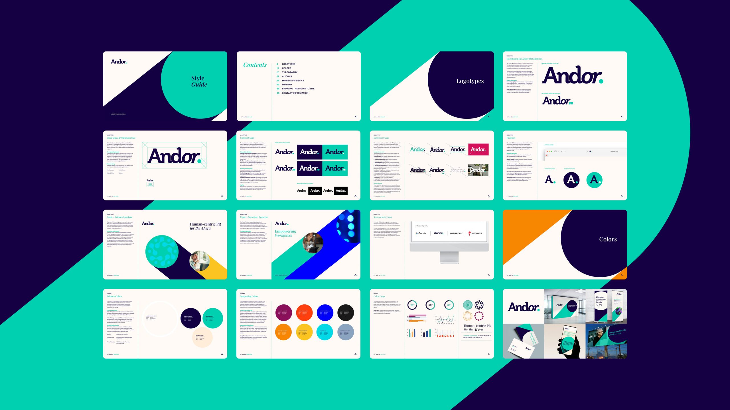
We then designed and coded Andor’s new website, organized around the industries it serves and its core services, from strategic communications and media relations to public policy and crisis management, with dedicated pages for its work, thinking, client coverage and media training. To carry the brand beyond the screen, we developed a collateral suite spanning business cards, event banners and a branded PowerPoint template, giving the team a consistent expression for every pitch and presentation.
The Impact: A Brand That Looks the Way It Thinks
Andor now has a brand that is confident, editorial and unmistakably human. The identity gives the firm a distinctive, ownable presence in a crowded agency landscape, the website gives prospective clients a clear view of its industries and expertise, and the collateral suite ensures every meeting and event carries the same polish. The result is a brand built to lead conversations about AI without losing sight of the people at the center of them.